Checkout Optimization: 17 Proven Tactics to Convert More Carts Into Orders
Your checkout page is where the money is made—or lost. A customer has browsed your store, chosen a product, and clicked “buy.” They’re ready to pay. And yet, nearly 70% of them will abandon their cart before completing the purchase.
Here’s the thing: most of that abandonment happens at checkout. Not on the product page, not in the cart—at the final step. The good news? Checkout optimization is one of the highest-ROI activities in e-commerce. Small improvements here translate directly into recovered revenue.
In this guide, I’ll walk you through 17 proven checkout optimization tactics, organized by impact. Whether you’re on Shopify, WooCommerce, or a custom platform, these principles apply universally.
Why Checkout Optimization Matters More Than You Think
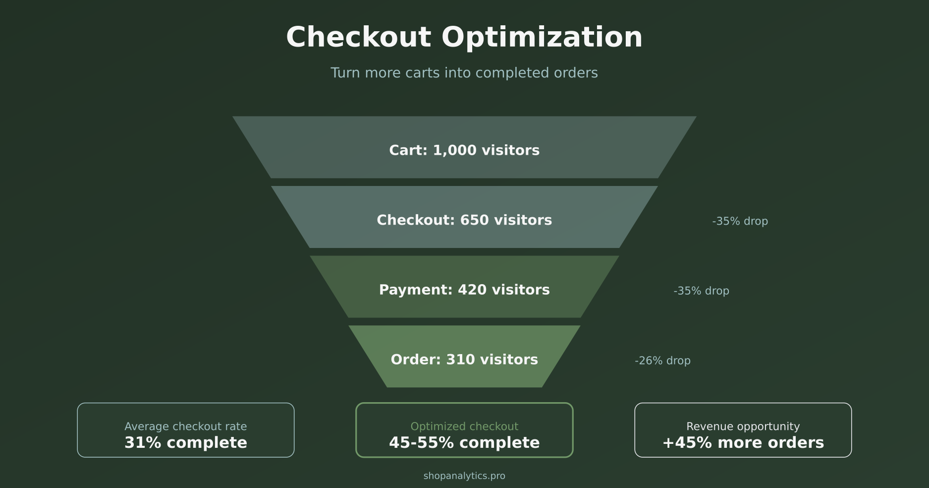
Consider the math: if you have 1,000 people reaching your cart monthly and a 30% checkout completion rate, you’re getting 300 orders. Improving that rate to 40% gives you 400 orders—a 33% revenue increase without spending a dime on acquisition. Want to see how that translates to your margins? Our break-even CPA calculator lets you plug in your AOV and margins to see what each extra conversion is worth.
Moreover, checkout improvements compound with everything else you do. Better ads, better product pages, better email campaigns—they all send more people to checkout. If your checkout leaks, you’re wasting that upstream investment.
This connects directly to cart abandonment—but checkout abandonment is its own category. Someone who abandons on the product page wasn’t ready to buy. Someone who abandons at checkout was ready—and you lost them.
The Top Reasons People Abandon Checkout
Before we fix problems, we need to understand them. According to Baymard Institute research, here are the primary reasons shoppers leave at checkout:
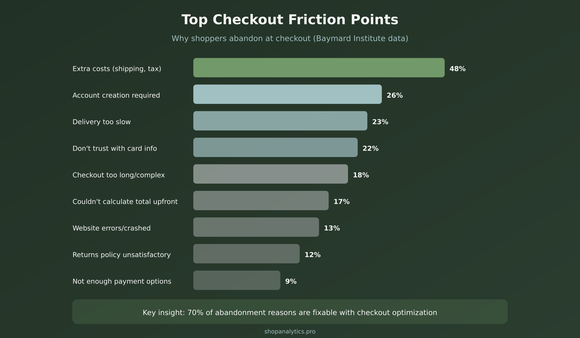
Notice that the top four reasons—extra costs, account requirements, slow delivery, and trust concerns—account for over half of all checkout abandonment. These aren’t minor UX issues. They’re fundamental blockers.
The encouraging part? Every single one of these is fixable. Let’s break down the solutions.
Checkout Optimization Tactic #1: Offer Guest Checkout
Mandatory account creation kills conversions. 26% of shoppers abandon specifically because they’re forced to create an account. Think about it from their perspective: they want to buy something, not commit to a relationship.
The fix is straightforward—offer guest checkout as the default option. You can still encourage account creation after purchase or offer it as an option, but never make it a barrier.
Implementation tips:
- Make “Continue as Guest” the most prominent option
- Offer account creation on the confirmation page with a simple “Save your details for faster checkout next time”
- If you must encourage accounts, offer a concrete benefit (10% off next order, order tracking)
On Shopify, guest checkout is enabled by default. On WooCommerce, check Settings → Accounts & Privacy → “Allow customers to place orders without an account.”
Tactic #2: Show All Costs Upfront
The #1 abandonment reason is unexpected costs at checkout. 48% of shoppers leave when they see surprise shipping fees, taxes, or handling charges they didn’t anticipate.
Transparency isn’t just ethical—it converts better. Here’s how to implement it:
- Show shipping estimates on product pages — “Free shipping” or “Shipping calculated at checkout” isn’t enough. Show actual costs.
- Include taxes in displayed prices — Or at minimum, show “plus applicable taxes” clearly
- Display order total early — Show the running total in the cart, not just at final checkout
- Offer free shipping thresholds — “Add $15 more for free shipping” converts better than surprise $8 shipping at checkout
If your shipping costs are genuinely high, consider building them into product prices and offering “free shipping.” The psychology of free shipping is powerful.
Tactic #3: Minimize Form Fields
Every additional form field increases friction. Baymard’s research shows that the average checkout has 14.88 form fields, but only 8 are actually necessary for most purchases.
Essential fields only:
- Email (for receipt and order updates)
- Name (for shipping label)
- Address (with auto-complete)
- Payment information
Fields to eliminate or make optional:
- Phone number (unless required for delivery)
- Company name
- Address line 2 (show only if needed)
- Separate billing address (default to same as shipping)
Additionally, use smart defaults. Auto-detect country from IP address. Auto-fill city and state from ZIP code. Every keystroke you save reduces abandonment.
Tactic #4: Add Express Payment Options
Express checkout options like Shop Pay, Apple Pay, Google Pay, and PayPal can reduce checkout time from minutes to seconds. For returning customers, it’s often one click.
The impact is significant:
- Shop Pay converts 1.72x better than regular checkout (according to Shopify)
- PayPal users complete purchases 60% faster
- Mobile wallets (Apple Pay, Google Pay) are essential for mobile conversion
Place express checkout buttons prominently—both in the cart and at the top of checkout. These shouldn’t be hidden alternatives; they should be featured options.
Tactic #5: Build Trust at Every Step
22% of shoppers abandon because they don’t trust the site with their payment information. In an era of data breaches and scams, this concern is legitimate.
Trust isn’t built with one element—it’s an accumulation of signals throughout the checkout experience:
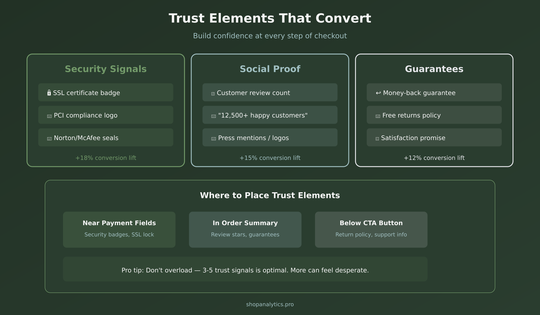
Security Signals
- SSL certificate badge near payment fields
- Payment processor logos (Visa, Mastercard, etc.)
- Security seal from Norton, McAfee, or similar
- “Secure checkout” messaging
Social Proof
- Review count and star rating
- “Trusted by 50,000+ customers”
- Press logos (“As seen in…”)
- Real-time purchase notifications (use sparingly)
Guarantees
- Money-back guarantee
- Free returns policy
- Clear contact information
- Live chat availability
Place security badges near the payment form—that’s where anxiety peaks. Put guarantees below the CTA button to overcome last-second hesitation.
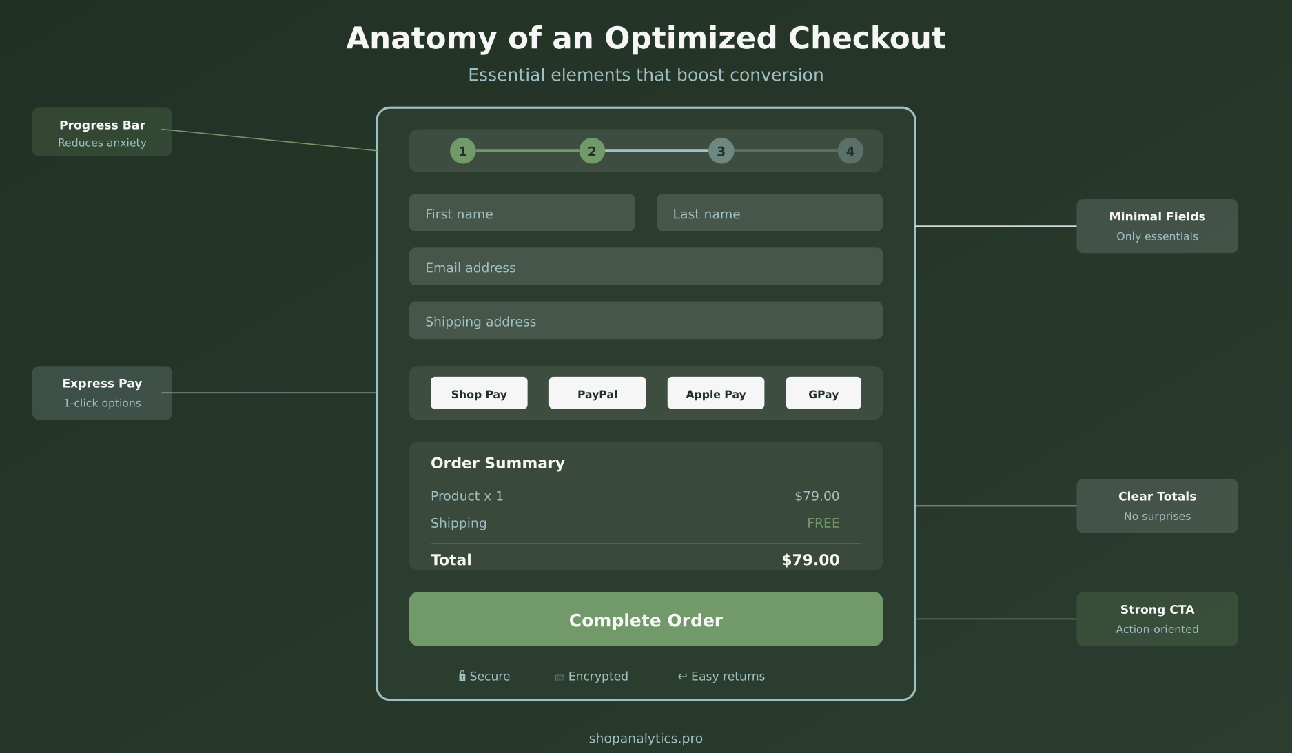
Tactic #6: Use a Progress Indicator
When shoppers can’t see how long checkout will take, they assume the worst. A clear progress indicator reduces perceived complexity and sets expectations.
Best practices:
- Show steps, not percentages (steps feel more concrete)
- Use descriptive labels: “Shipping” → “Payment” → “Review” → “Confirm”
- Highlight the current step clearly
- Consider a single-page checkout instead (see next tactic)
For proper event tracking, fire checkout step events at each progress point. This lets you identify exactly where people drop off.
Tactic #7: Consider Single-Page Checkout
Multi-step checkouts can feel endless. Single-page checkouts show everything at once, reducing the “how much longer?” anxiety.
However, this isn’t universally better. Single-page works well when:
- You have minimal form fields
- Your average cart is simple (1-3 items)
- Mobile traffic is dominant
Multi-step may work better when:
- You collect lots of information (B2B, customization)
- Cart sizes are large and need review
- Your audience skews older and prefers guided flows
The only way to know for sure? A/B test it.
Tactic #8: Optimize for Mobile
Mobile accounts for over 60% of e-commerce traffic, but conversion rates on mobile are typically half of desktop. Checkout is where mobile experience matters most.
Mobile checkout essentials:
- Large tap targets — Buttons should be at least 44px tall
- Appropriate keyboard types — Email field triggers email keyboard, phone field triggers number pad
- Mobile wallets prominent — Apple Pay and Google Pay should be the first options
- Sticky order summary — Let users see their total without scrolling
- Avoid hover states — No information should require hovering
Test your checkout on actual mobile devices, not just browser emulators. The feel of thumb-scrolling through a checkout reveals issues you won’t catch otherwise.
Tactic #9: Display Order Summary Throughout
Shoppers want constant confirmation they’re buying the right things at the right price. An always-visible order summary provides this reassurance.
Include in the summary:
- Product thumbnail images
- Product names and variants (size, color)
- Quantities with edit option
- Line item prices
- Discount codes applied
- Shipping cost
- Tax (if applicable)
- Total clearly highlighted
On desktop, use a sticky sidebar. On mobile, use a collapsible summary that shows total by default and expands for details.
Tactic #10: Provide Multiple Payment Options
9% of shoppers abandon because their preferred payment method isn’t available. In some markets, this number is much higher.
Essential payment methods:
- Credit/debit cards (Visa, Mastercard, Amex)
- PayPal
- Mobile wallets (Apple Pay, Google Pay)
- Buy Now Pay Later (Klarna, Affirm, Afterpay)
Market-specific additions:
- Europe: iDEAL (Netherlands), Bancontact (Belgium), SEPA
- Asia: Alipay, WeChat Pay
- Latin America: Boleto, OXXO, local cards
Buy Now Pay Later options are particularly powerful for higher-priced items. They can increase average order value by 20-30% while also improving conversion rates.
Tactic #11: Implement Smart Error Handling
Nothing frustrates shoppers more than cryptic error messages or forms that clear after an error. Smart error handling keeps customers moving forward instead of ragequitting.
Error handling best practices:
- Inline validation — Show errors immediately as users type, not after form submission
- Specific messages — “Please enter a valid email address” not “Invalid input”
- Preserve entered data — Never clear the form on error
- Scroll to error — Automatically focus on the field that needs attention
- Success confirmation — Green checkmarks for validated fields
For payment errors, provide actionable guidance: “Card declined. Please check your card details or try a different payment method.”
Tactic #12: Offer Live Chat Support
Sometimes customers have a question that, if unanswered, stops the purchase. Having live chat available during checkout provides an escape hatch for these moments.
Effective checkout chat:
- Show chat bubble on checkout pages (not just homepage)
- Proactively offer help after 60+ seconds of inactivity
- Train agents on common checkout questions
- Have pre-written answers for shipping, returns, sizing
If 24/7 chat isn’t feasible, clearly show chat availability hours and offer email as an alternative. Any support option is better than none.
Tactic #13: Use Address Auto-Complete
Address entry is tedious and error-prone. Auto-complete drastically reduces friction and mistakes.
Google Places Autocomplete is the most popular option. As users type their address, suggestions appear. One click fills the entire address—street, city, state, ZIP, country.
Benefits:
- Reduces keystrokes by 80%+
- Eliminates typos in addresses
- Reduces shipping errors and returns
- Feels fast and modern
Most e-commerce platforms have plugins or apps for this. On Shopify, it’s built into Checkout. On WooCommerce, try the Google Address Autocomplete plugin.
Tactic #14: Save Cart and Enable Recovery
Not everyone who abandons checkout is lost forever. Many are interrupted, distracted, or need time to decide. Cart persistence and recovery emails bring them back.
Cart persistence:
- Save cart contents in cookies (for guests) and accounts (for logged-in users)
- Persist for at least 7-14 days
- Show “Your cart is waiting” when they return
Abandoned checkout emails:
- Send first email within 1 hour of abandonment
- Include product images and direct link to resume checkout
- Consider offering incentive in 2nd or 3rd email (discount, free shipping)
- Sequence: 1 hour, 24 hours, 3 days
This requires capturing email early in checkout. Ask for email as the first field—it enables recovery even if they abandon later.
Tactic #15: Test Your CTA Button
The final checkout button deserves special attention. It’s the last click between intent and revenue.
CTA button optimization:
- Clear copy — “Complete Order” or “Place Order” beats “Submit” or “Continue”
- Include the total — “Pay $79.00” removes ambiguity
- Visual prominence — Contrasting color, large size, plenty of whitespace
- Single CTA — Don’t compete with other buttons near it
- Mobile: full-width — Easy thumb target at bottom of screen
Adding micro-copy below the button helps too: “30-day money-back guarantee” or “You won’t be charged until you click this button.”
Tactic #16: Remove Distractions
Checkout is not the place for upsells, navigation menus, or promotional banners. Every element that isn’t moving the customer toward purchase is a potential exit.
What to remove:
- Main navigation menu (keep logo linking to home)
- Footer links (except essential: privacy, terms, contact)
- Promotional banners and ads
- Aggressive cross-sell/upsell modules
- Newsletter signup prompts
Shopify’s checkout does this well by default—minimal header, no navigation, focused layout. If you’re on a platform that doesn’t enforce this, make it a priority.
Tactic #17: Show Shipping Options Early
23% of abandonment comes from delivery being too slow. But sometimes “too slow” just means “unexpected.” Showing shipping options earlier manages expectations.
Best practices:
- Display estimated delivery dates, not just shipping speed names
- “Arrives by Friday, Feb 7” is clearer than “Standard Shipping (5-7 days)”
- Show shipping calculator in cart (before checkout)
- Offer expedited options for time-sensitive buyers
- Be honest about delays—surprises destroy trust
This ties back to understanding purchase intent signals. Someone willing to pay for expedited shipping has high intent—make that option visible.
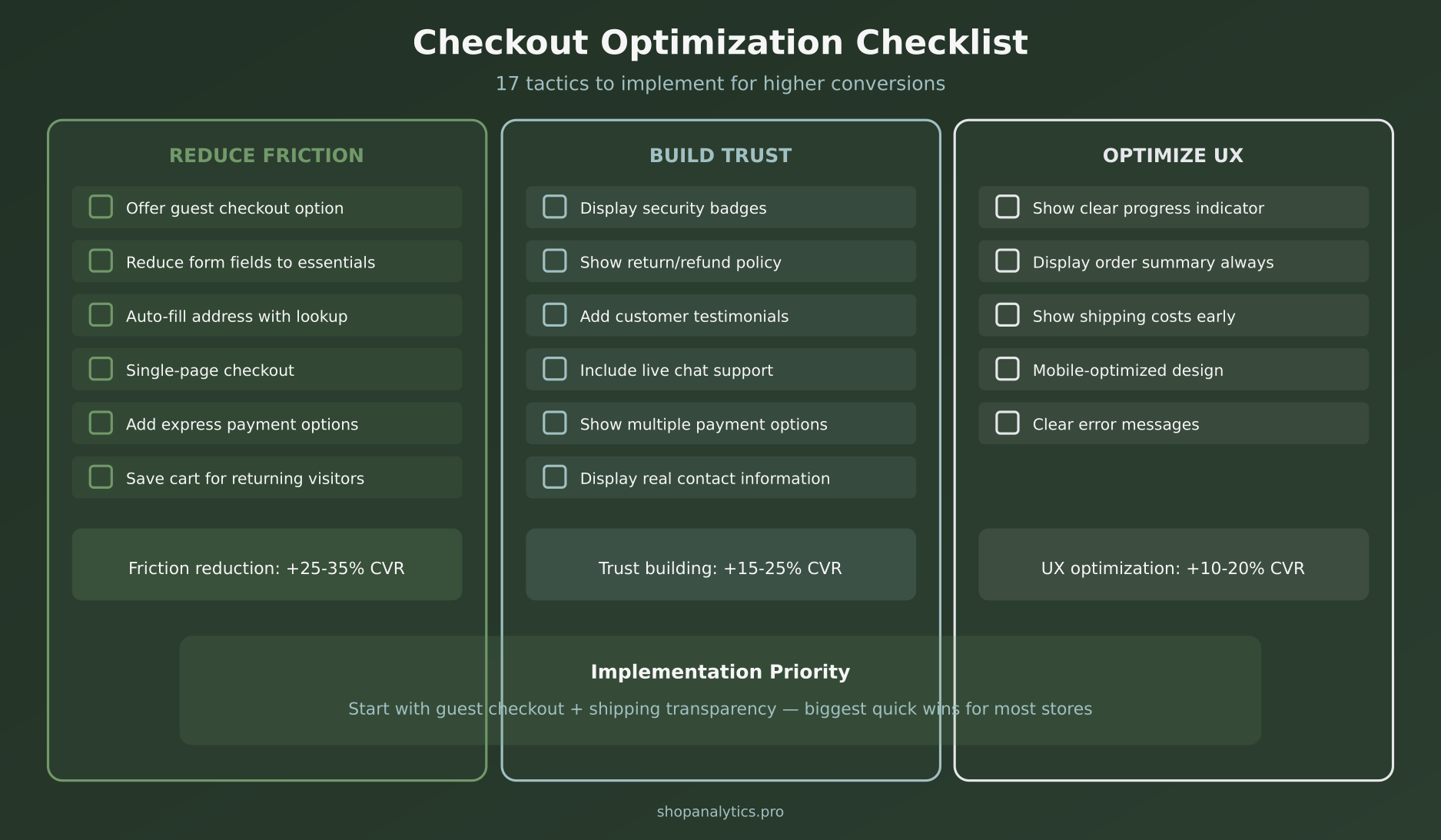
Your Checkout Optimization Checklist
Here’s everything we’ve covered, organized by priority. Start with the quick wins and work your way down:
Measuring Checkout Performance
You can’t optimize what you don’t measure. Set up tracking for these key metrics:
- Checkout initiation rate — % of carts that start checkout
- Checkout completion rate — % of checkout starts that complete
- Step-by-step drop-off — Where in checkout people leave
- Payment failure rate — How often payments are declined
- Time to complete checkout — Longer isn’t always worse, but spikes indicate problems
Your analytics setup should capture checkout_started, checkout_step, and purchase events. Segment by device, traffic source, and new vs. returning to find specific issues.
Key Takeaways
- Guest checkout is essential — 26% abandon due to forced account creation
- Transparency prevents abandonment — Show all costs upfront, no surprises
- Fewer fields = more conversions — Every field adds friction
- Express checkout is powerful — Shop Pay, PayPal, Apple Pay dramatically speed up purchase
- Trust must be visible — Security badges, guarantees, and social proof near payment
- Mobile requires special attention — Over 60% of traffic, under 50% of conversions
- Test everything — Single-page vs. multi-step, CTA copy, trust element placement
Checkout optimization isn’t a one-time project. It’s an ongoing process of identifying friction, hypothesizing solutions, testing changes, and iterating. Start with the highest-impact tactics—guest checkout, cost transparency, and express payments—and build from there. Every percentage point you gain in checkout conversion goes straight to your bottom line.
Keep reading: how to find where your checkout funnel loses buyers.
Sophie Andersson
Technical marketer with 7+ years in e-commerce growth teams. Started as a developer, moved into marketing, and now lives at the intersection of both worlds. Believes that good analytics shouldn't require a PhD to understand.
More about me →