Product Page Optimization: 15 Elements That Turn Browsers Into Buyers
Your product page is where buying decisions happen. A customer has found your product through search, ads, or browsing. They’re interested. Now they need to decide: add to cart or leave?
Here’s the thing about product page optimization: small changes can have massive impact. A better image, clearer pricing, or more visible reviews—each tweak directly affects whether someone clicks “Add to Cart.” And unlike traffic acquisition, improving your product pages doesn’t cost more money. It just makes the traffic you already have more valuable.
In this guide, I’ll break down 15 product page elements that separate high-converting pages from forgettable ones. We’ll cover what to show above the fold, how to use images effectively, where to place social proof, and more.
Why Product Page Optimization Matters
Consider the math: if your product pages have a 5% add-to-cart rate and you improve that to 7%, you’ve increased your revenue potential by 40%—with the exact same traffic. That’s the power of conversion rate optimization at the product level.
Moreover, product pages are where your purchase intent signals are strongest. Someone viewing a product page has already expressed interest. Your job is to remove doubts and make the purchase decision easy.
The average e-commerce add-to-cart rate is around 8-10%. Top performers hit 12-15%. The difference? Better product page optimization.
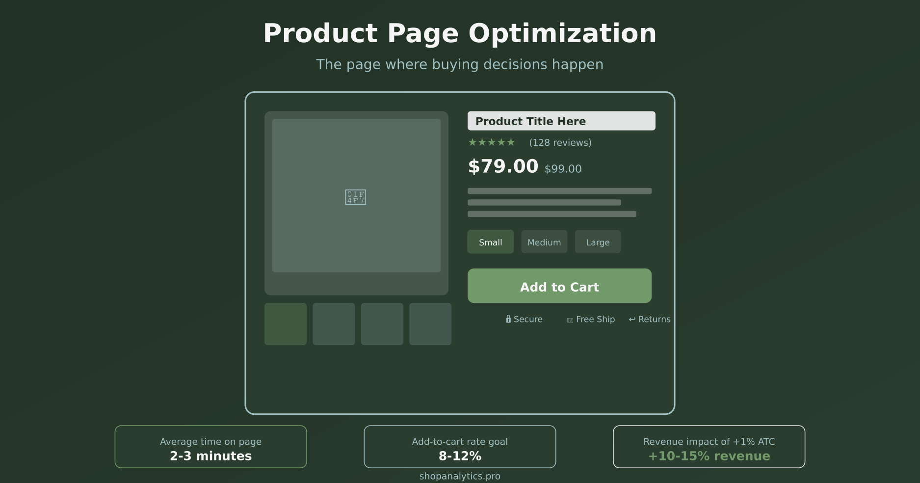
What Visitors Need to See Above the Fold
The “fold” is the point where visitors must scroll to see more. Everything above it is prime real estate—and studies show that 80% of viewing time is spent above the fold.
Here are the six critical elements that must appear above the fold on every product page:
1. Product Images
Your main product image is the first thing visitors see. It should be high-quality, well-lit, and show the product clearly. We’ll dive deeper into image optimization below.
2. Product Title
Clear, descriptive, and benefit-oriented. “Men’s Waterproof Hiking Boots – Lightweight Trail Shoes” tells visitors exactly what they’re looking at. Avoid generic titles that don’t differentiate your product.
3. Price
Price should be immediately visible and prominent. If there’s a sale, show both the original price (crossed out) and the sale price. Unclear pricing creates friction and anxiety.
4. Star Rating and Review Count
Social proof starts here. Show star ratings with the number of reviews right near the title. “★★★★★ (247 reviews)” builds immediate credibility. Link to the full reviews section below.
5. Variant Selectors
If your product comes in different sizes, colors, or configurations, those selectors need to be visible and easy to use. Unclear variant selection is a major source of cart abandonment.
6. Add to Cart Button
The CTA must be above the fold, prominent, and visually distinct. Use contrasting colors. “Add to Cart” is clearer than “Buy Now” for most products. Make the button large enough to tap easily on mobile.
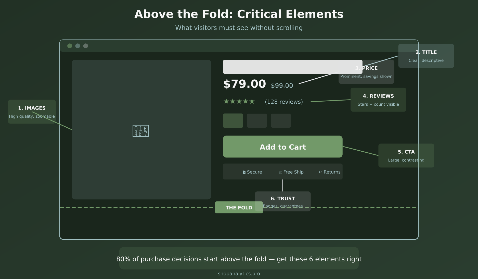
Product Page Element #1: High-Quality Images
Images account for over 60% of purchase decisions online. When customers can’t touch, feel, or try your product, photos become their primary decision-making tool.
Types of Images Every Product Needs
Hero shot: Clean background, full product visible, professional lighting. This is your primary image that appears in search results and category pages.
Scale/context shot: Show the product in use or next to a reference object. Customers need to understand actual size—how big is that bag? How tall is that lamp?
Detail shots: Close-ups of materials, textures, stitching, buttons, labels. These answer questions about quality and craftsmanship.
Lifestyle shots: The product in an aspirational context. A chair in a beautifully decorated room. A jacket on someone hiking. These help customers imagine owning and using the product.
Technical Requirements
- Resolution: Minimum 1000×1000 pixels, ideally 2000×2000 for zoom functionality
- Aspect ratio: 1:1 (square) creates consistency across your catalog
- Format: WebP with JPG fallback for optimal loading speed
- Quantity: 5-8 images per product is the sweet spot
- Zoom: Enable hover zoom on desktop, pinch zoom on mobile
Additionally, consider adding product video. According to Shopify research, product videos can increase conversions by up to 30%. Even a simple 360-degree spin or 15-second demonstration helps.
Element #2: Compelling Product Titles
Your product title does double duty: it tells customers what they’re looking at, and it helps search engines understand your page.
Good title formula: [Brand] + [Product Type] + [Key Feature/Benefit] + [Variant if applicable]
Examples:
- “Nike Air Max 270 Running Shoes – Black/White”
- “Organic Cotton Fitted Sheet – Queen Size, Deep Pocket”
- “Wireless Noise-Canceling Headphones – 40 Hour Battery”
Avoid keyword stuffing, but do include terms customers actually search for. Your title should read naturally while being descriptive.
Element #3: Clear Pricing Display
Price anxiety kills conversions. Make your pricing crystal clear:
- Font size: Price should be one of the largest text elements on the page
- Sale prices: Show original price crossed out, sale price highlighted
- Savings: Display percentage or dollar amount saved (“Save 20%” or “Save $30”)
- Unit pricing: For consumables, show per-unit cost (“$0.50/oz”)
- Payment options: “Or 4 payments of $25 with Klarna” can reduce price sensitivity
If your product has variable pricing based on options, update the displayed price dynamically as customers select variants. Surprises at checkout lead to abandonment.
Element #4: Social Proof That Converts
92% of consumers read reviews before making a purchase. Social proof isn’t optional—it’s essential.
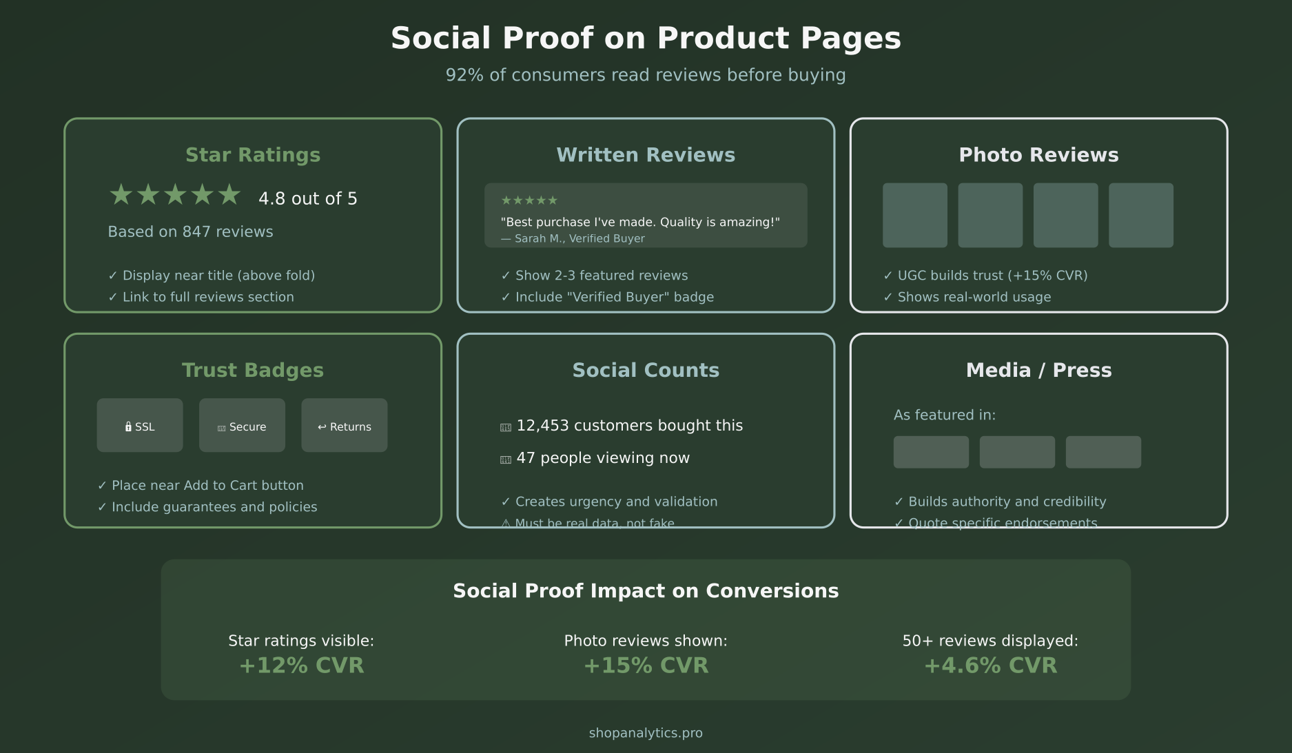
Star Ratings
Display average rating and total review count near the product title. Products with ratings visible convert 12% better than those without.
Written Reviews
Feature 2-3 highlighted reviews above the fold or in an easily accessible section. Include “Verified Buyer” badges to increase credibility. Allow filtering by rating and keyword.
Photo Reviews
User-generated content (UGC) showing real customers with your product builds trust like nothing else. Photo reviews increase conversion by an additional 15% on top of text reviews.
Trust Badges
Security seals, payment logos, satisfaction guarantees, and return policy badges reduce purchase anxiety. Place these near the Add to Cart button where hesitation peaks.
Social Counts
“12,453 customers bought this” or “47 people viewing now” creates urgency and validation. However, these must be real numbers—fake scarcity backfires badly if discovered.
Element #5: Persuasive Product Descriptions
Your product description should answer every question a customer might have while emphasizing benefits over features.
Structure for scannable descriptions:
- Opening hook: 1-2 sentences highlighting the main benefit
- Bullet points: 4-6 key features translated into benefits
- Detailed paragraph: For customers who want to read more
- Specifications: Materials, dimensions, care instructions
Feature vs. Benefit example:
- Feature: “Made with Gore-Tex membrane”
- Benefit: “Stay completely dry in any weather without overheating”
Customers don’t buy features—they buy solutions to problems. Lead with what the product does for them.
Element #6: Variant Selection Done Right
If your products have variants (size, color, material, etc.), how you present those options significantly impacts conversion.
Best practices for variants:
- Visual swatches: For colors, show actual color chips, not just names
- Size guides: Link to detailed sizing information right next to size selector
- Stock status: Show which variants are available and which are low/out of stock
- Image update: When a customer selects a color, update the main image to show that color
- Price update: If variants have different prices, update dynamically
Unclear variant selection causes customers to add wrong items, leading to returns—or worse, they abandon because they’re confused.
Element #7: The Add to Cart Button
Your CTA button is the single most important element on the page. Everything else exists to drive clicks on this button.
CTA optimization:
- Color: High contrast against your background—it should pop
- Size: Large enough to tap easily on mobile (minimum 44px height)
- Copy: “Add to Cart” is standard and clear. Some brands test “Add to Bag” or product-specific copy
- Position: Above the fold, right side of desktop layout
- Sticky: On mobile, consider a sticky bottom bar that keeps CTA always visible
After clicking, provide clear feedback—show the cart icon update, display a mini-cart, or confirm the add. Don’t leave customers wondering if their click worked.
Element #8: Shipping and Return Information
Unexpected shipping costs are the #1 reason for checkout abandonment. Address this proactively on the product page.
Display clearly:
- Shipping cost or “Free shipping” message
- Estimated delivery date
- Return policy summary
- Any guarantees (satisfaction, price match)
Even if details are in your footer or a separate page, surface the key points on the product page where decisions are made.
Element #9: Urgency and Scarcity (Used Ethically)
Urgency elements can increase conversions when used honestly:
- Low stock warnings: “Only 3 left in stock” (if true)
- Sale deadlines: “Sale ends in 2 days”
- Shipping cutoffs: “Order in next 2 hours for delivery by Friday”
The key word is honestly. Fake countdown timers and artificial scarcity erode trust. If the “limited time sale” runs forever, customers will notice—and they won’t believe you next time.
Element #10: Mobile Optimization
Over 60% of e-commerce traffic is mobile, but mobile conversion rates lag desktop by 50% or more. Product pages are a major factor.
Mobile product page essentials:
- Image gallery: Swipeable, not tiny thumbnails
- CTA visibility: Sticky bottom bar keeps Add to Cart always accessible
- Touch targets: Variant selectors large enough to tap accurately
- Collapsed sections: Use accordions for descriptions, reviews, FAQs to reduce scroll length
- Fast loading: Optimize images aggressively for mobile networks
Test on actual devices, not just browser emulators. The experience of scrolling, tapping, and swiping reveals issues you won’t catch otherwise.
Element #11: Related and Recommended Products
Cross-sells and upsells on product pages can increase average order value by 10-30% when done right.
Types of recommendations:
- “Frequently bought together”: Complementary products that make sense as a bundle
- “Customers also viewed”: Similar products for comparison shoppers
- “Complete the look”: For fashion, show outfit suggestions
- “You may also like”: Personalized based on browsing history
Place these below the main product information. They shouldn’t distract from the primary purchase but should be visible for customers who scroll.
Element #12: FAQ Section
A product-specific FAQ addresses common objections and questions before they become reasons not to buy.
How to build your FAQ:
- Review customer service inquiries about the product
- Check negative reviews for unanswered questions
- Look at competitor product pages for common concerns
- Address sizing, materials, compatibility, care instructions
Structure FAQs as collapsible accordions to keep the page clean while making information accessible.
Element #13: Page Speed
Every second of load time costs conversions. Research shows that conversion rates drop by an average of 4.42% with each additional second of load time.
Speed optimization priorities:
- Image compression: Use modern formats (WebP), lazy loading for below-fold images
- Code efficiency: Minimize JavaScript, defer non-critical scripts
- CDN: Serve assets from edge servers close to customers
- Review apps: Third-party review widgets often slow pages significantly
Use Google PageSpeed Insights to identify specific issues. Aim for a mobile score above 70.
Element #14: SEO Optimization
Product pages should attract organic search traffic, not just convert paid traffic.
Product page SEO checklist:
- Title tag: Include product name, key feature, and brand
- Meta description: Compelling summary with call to action
- H1 tag: Product title (one per page)
- Image alt text: Descriptive text for every product image
- Schema markup: Product schema with price, availability, reviews
- Unique descriptions: Avoid copying manufacturer descriptions that appear on competitor sites
For tracking organic product page performance, ensure your event tracking captures view_item events with proper attribution.
Element #15: Structured Data and Rich Results
Proper schema markup makes your products eligible for rich results in Google search—showing prices, availability, and ratings directly in search listings.
Essential product schema fields:
- name (product title)
- image (main product image URL)
- description
- sku
- offers (price, availability, currency)
- aggregateRating (if you have reviews)
- brand
Most e-commerce platforms handle this automatically, but verify with Google’s Rich Results Test.
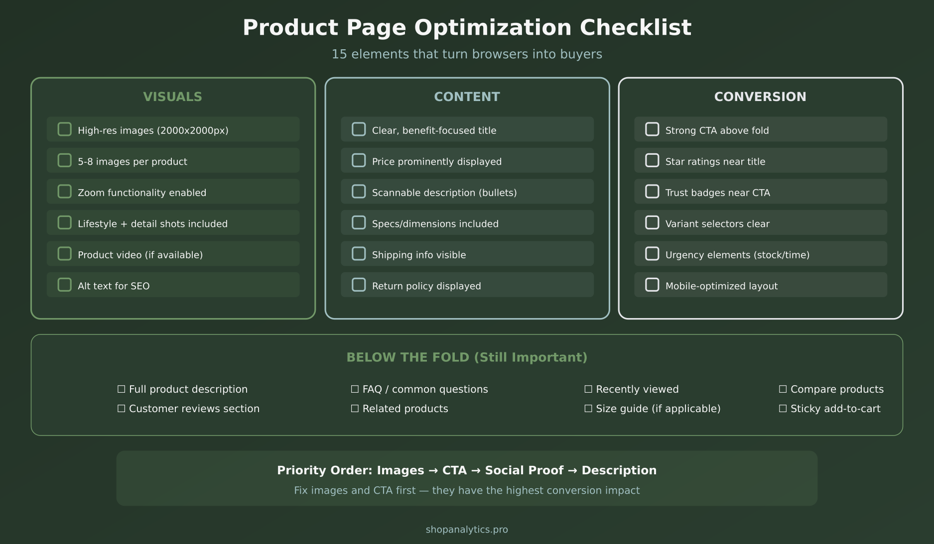
Your Product Page Optimization Checklist
Here’s everything we’ve covered, organized for implementation:
Measuring Product Page Performance
You can’t optimize what you don’t measure. Track these key metrics:
- Add-to-cart rate: % of product page visitors who add to cart (target: 8-12%)
- Time on page: How long visitors spend (2-3 minutes is healthy)
- Scroll depth: Are visitors seeing below-fold content?
- Image engagement: Are visitors viewing multiple images, using zoom?
- Exit rate: % leaving from this page (lower is better)
Segment by traffic source, device, and customer segment to identify specific optimization opportunities.
A/B Testing Product Pages
Product pages are prime candidates for A/B testing. High-impact tests include:
- Image order and primary image selection
- CTA button color, size, and copy
- Price display format
- Review placement (above vs. below fold)
- Description length and format
- Trust badge placement
Start with high-traffic products where you can reach statistical significance faster. Our ecommerce merchandising dashboard helps you identify top products by revenue and traffic, so you know exactly which pages to prioritize.
Key Takeaways
- Images drive decisions — Invest in high-quality, varied product photography
- Above the fold matters most — Image, title, price, rating, CTA all visible without scrolling
- Social proof is essential — Reviews, ratings, and UGC build trust
- Benefits over features — Tell customers what the product does for them
- Mobile requires special attention — Most traffic is mobile, optimize accordingly
- Speed impacts conversion — Every second of load time costs sales
- Test and iterate — Use data to continuously improve
Product page optimization isn’t a one-time project. It’s an ongoing process of understanding what your customers need to make a decision and removing every obstacle between viewing and buying. Start with the basics—images, CTA, and social proof—then layer in refinements based on your data.
Keep reading: landing page optimization: 12 principles that turn paid traffic into revenue.
Sophie Andersson
Technical marketer with 7+ years in e-commerce growth teams. Started as a developer, moved into marketing, and now lives at the intersection of both worlds. Believes that good analytics shouldn't require a PhD to understand.
More about me →