Landing Page Optimization: 12 Principles That Turn Paid Traffic Into Revenue
You’re spending thousands on ads. Traffic is flowing. But your landing page? It’s sending visitors right back to Google. Here’s the thing — most e-commerce stores send paid traffic to their homepage or a generic product listing. That’s like paying for a billboard and pointing it at a parking lot.
Landing page optimization is the highest-leverage activity in your marketing stack. A well-optimized landing page can double or triple your conversion rate without spending an extra dollar on ads. In fact, the difference between a mediocre landing page and a great one often means the difference between profitable campaigns and wasted budget. If you’re not sure what conversion rate you need to hit, our break-even CPA & max CPC calculator can help you set clear targets before you start optimizing.
In this guide, I’ll walk you through 12 proven principles for landing page optimization that turn paid traffic into actual revenue. Whether you’re running Google Ads, Facebook campaigns, or influencer partnerships, these principles apply across the board.
Why Landing Pages Beat Your Homepage for Paid Traffic
Let’s start with the fundamental question: why not just send ad traffic to your homepage? After all, it showcases your brand, your products, and your story. Sounds reasonable, right?
However, there’s a critical problem. Your homepage tries to serve everyone — returning customers, browsers, people who came from organic search. A landing page, on the other hand, serves one specific audience with one specific message. That focus is what drives conversions.
Consider the numbers. According to Unbounce’s conversion benchmark report, dedicated landing pages convert at 2-5x the rate of generic website pages. For e-commerce specifically, well-optimized landing pages typically convert at 5-10% compared to the 1-3% average for homepages receiving ad traffic.
The reason is simple: relevance. When someone clicks an ad for “50% off running shoes,” they expect to see exactly that. Not your entire shoe collection. Not your brand story. Just the running shoes at 50% off. This principle has a name, and it’s the most important concept in landing page optimization.
Message Match: The #1 Landing Page Optimization Principle
Message match is the alignment between what your ad promises and what your landing page delivers. It’s the single most impactful factor in landing page performance. Get this wrong, and nothing else matters.
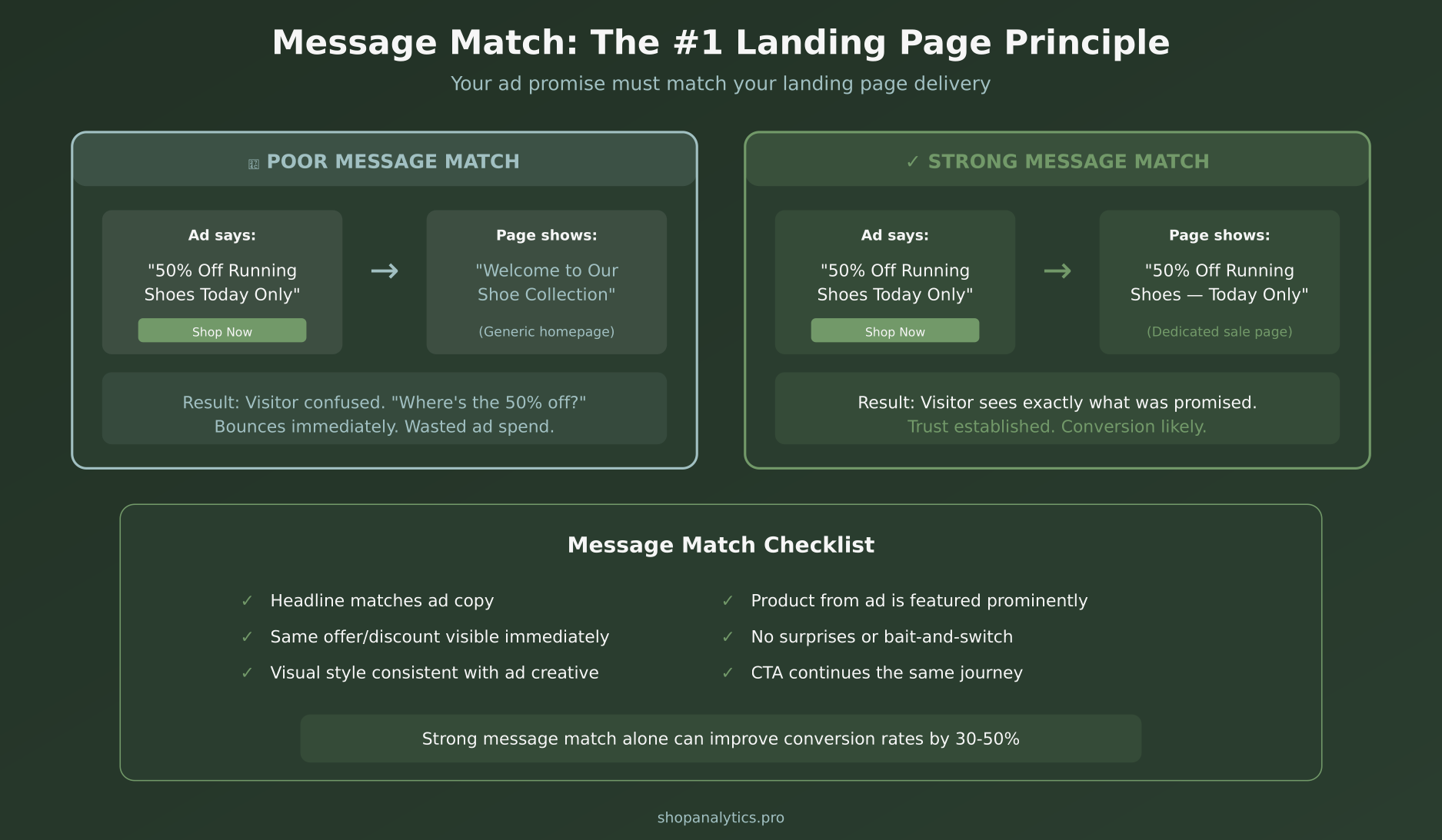
Here’s what message match looks like in practice. If your ad says “Free shipping on orders over $50,” your landing page headline should mention free shipping immediately. If your ad promotes a specific product, that exact product should be front and center when the page loads.
Additionally, message match goes beyond just the headline. It includes:
- Visual consistency — similar colors, imagery, and style between ad and page
- Offer alignment — the same discount, deal, or value proposition
- Emotional continuity — the same tone and urgency level
- Product focus — the exact item or category from the ad
In my experience, fixing message match alone typically improves conversion rates by 30-50%. It’s often the quickest win in any checkout optimization or CRO initiative.
Choosing the Right Landing Page Type
Not all landing pages are created equal. The type you need depends entirely on your campaign goal. Using the wrong type is like using a screwdriver as a hammer — technically possible, but you won’t get great results. If you’re unsure what types of pages you’re currently sending traffic to, our landing page classifier can categorize your URLs by page type automatically.
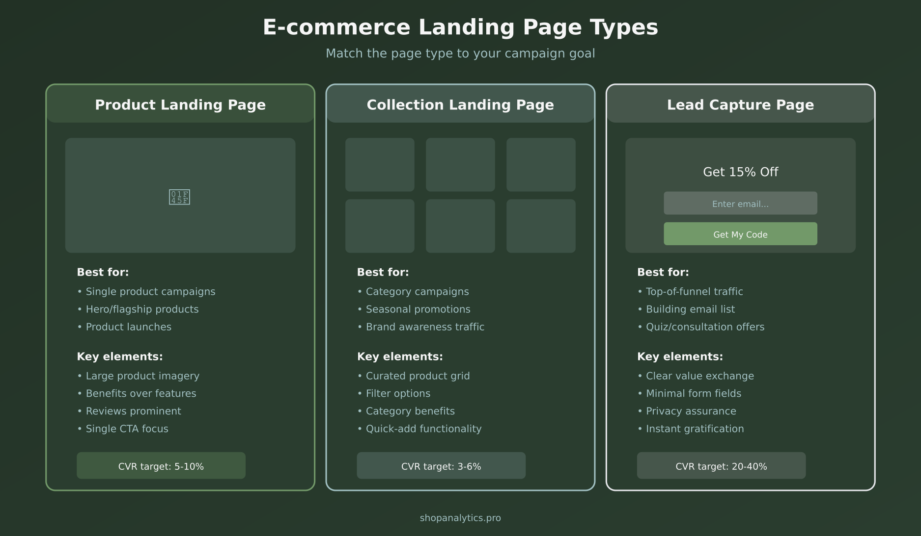
Product Landing Pages
Best for single-product campaigns, hero product launches, and retargeting ads. These pages focus entirely on one product with large imagery, benefit-driven copy, prominent reviews, and a single CTA. Target conversion rate: 5-10%.
For example, if you’re running ads for your best-selling skincare serum, create a dedicated product landing page. It should feature the product hero image, key benefits (not just ingredients), customer testimonials, and a clear “Add to Cart” button. This is where strong product page optimization principles come into play.
Collection Landing Pages
Best for category campaigns, seasonal promotions, and brand awareness traffic. These pages showcase a curated grid of products with filtering options. Target conversion rate: 3-6%.
Consequently, collection pages work well when your ad targets a broader audience. “Summer dresses under $50” works better as a collection page than a single product page because visitors want to browse options within that specific category.
Lead Capture Pages
Best for top-of-funnel traffic, email list building, and quiz-based marketing. These pages offer something valuable (discount code, guide, quiz results) in exchange for an email. Target conversion rate: 20-40%.
Lead capture pages are particularly effective for cold traffic that isn’t ready to buy yet. Instead of pushing for an immediate sale, you’re building a relationship. The micro-conversion of an email signup can be worth significantly more than a bounced visitor.
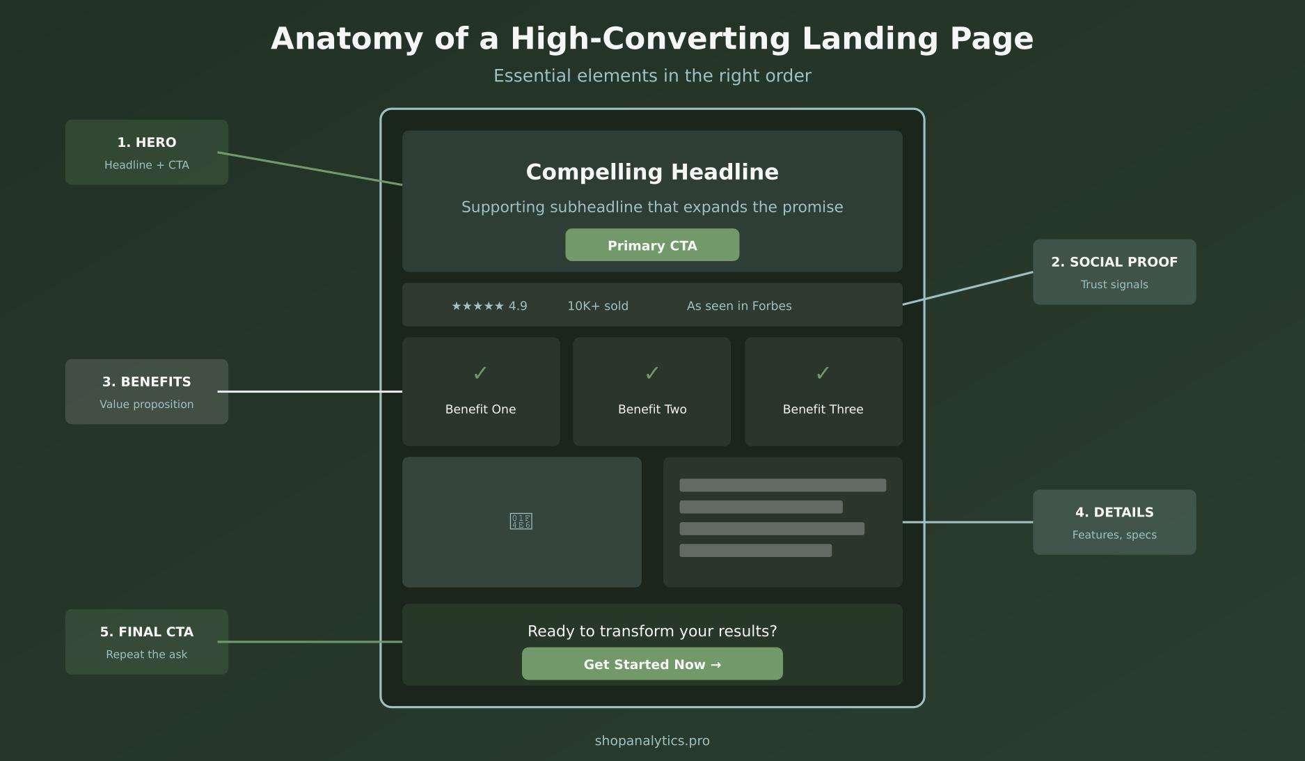
The 12 Principles of High-Converting Landing Pages
Now let’s break down the 12 principles that separate high-converting landing pages from expensive disappointments. I’ve organized these into three categories: Foundation, Persuasion, and Conversion.
Foundation Principles (Get These Right First)
1. Strong message match with your ad. As discussed above, this is non-negotiable. Every element on your landing page should reinforce the promise made in your ad creative.
2. Single, focused goal. Your landing page should have one CTA. Not three. Not five. One. Every element on the page should guide visitors toward that single action. If you’re selling a product, the goal is “Add to Cart.” If you’re capturing leads, the goal is “Submit Email.” That’s it.
3. Clear value proposition in the headline. Visitors decide whether to stay or leave within 3-5 seconds. Your headline must immediately communicate what they’ll get and why it matters. Moreover, it should speak to benefits, not features. “Sleep better tonight” beats “Memory foam mattress with cooling gel.”
4. Remove navigation distractions. Strip away the main navigation menu, footer links, and sidebar widgets. Every link that isn’t your CTA is a potential exit point. Research from NNGroup shows that reducing choices significantly improves decision-making speed.
5. Fast loading speed. If your page takes more than 3 seconds to load, you’re losing visitors before they even see your offer. Specifically, each additional second of load time reduces conversions by approximately 7%. Compress images, minimize scripts, and use a CDN.
Persuasion Principles (Build Trust and Desire)
6. Benefits-focused copy. Write about outcomes, not specifications. Instead of “100% organic cotton,” try “Soft enough to sleep in, tough enough for daily wear.” Features tell people what something is. Benefits tell people what it does for them.
7. Social proof above the fold. Star ratings, review counts, “As seen in” badges, or customer photo grids — place these near the top of your page. According to Baymard Institute research, 95% of shoppers read reviews before purchasing. Make those reviews impossible to miss.
8. Compelling visuals. High-quality product photography or hero imagery is essential. Show the product in use, not just on a white background. Furthermore, include multiple angles and lifestyle shots. Visual content processes 60,000 times faster than text.
9. Urgency and scarcity elements. Countdown timers, stock levels, and limited-time offers work — but only when they’re real. Fake urgency erodes trust permanently. Use authentic scarcity like “Sale ends Sunday” or “Only 12 left in stock” when those constraints genuinely exist.
10. Risk reversal. Money-back guarantees, free returns, and satisfaction promises reduce the perceived risk of purchasing. Place these near your CTA to address the “What if I don’t like it?” objection right when it matters most. This is closely tied to the trust elements discussed in our cart abandonment guide.
Conversion Principles (Close the Deal)
11. CTA visible without scrolling. Your primary call-to-action must be visible in the initial viewport. Don’t make visitors scroll to find the buy button. Above-the-fold CTAs consistently outperform below-the-fold placement by 20-30%.
12. High-contrast CTA button. Your CTA button should be the most visually prominent element on the page. Use a color that contrasts sharply with the background. Make it large enough to tap easily on mobile. The button text should be action-oriented: “Get My Discount” outperforms “Submit.”
Mobile Landing Page Optimization
Here’s a stat that should make you rethink everything: over 70% of e-commerce ad traffic now comes from mobile devices. Yet most landing pages are designed desktop-first. That’s a fundamental mismatch.
Mobile landing page optimization requires specific considerations:
- Thumb-friendly CTA buttons — at least 48x48px tap targets
- Shorter headlines — 6-8 words max for mobile
- Collapsible content — use accordions for detailed info
- Sticky CTA bar — keep the buy button visible during scroll
- Simplified forms — every extra field reduces mobile conversions by ~10%
- Click-to-call — add tap-to-dial for phone support
In addition, test your landing pages on actual mobile devices. Emulators don’t catch everything. Specifically, pay attention to load times on 4G networks and make sure images scale properly.
How to Test Your Landing Pages
Building a great landing page is step one. Testing and improving it is where the real gains happen. If you’re not running tests, you’re leaving money on the table.
Here are the highest-impact elements to A/B test on your landing pages, ranked by typical impact:
- Headline variations — test different value propositions and angles
- Hero image vs. video — video can increase conversions by 80% (or hurt them)
- CTA button copy and color — small changes, surprisingly big impact
- Social proof placement — above the fold vs. below
- Long form vs. short form — more info helps for complex or expensive products
- Price presentation — anchoring, crossed-out prices, installment options
Importantly, test one element at a time. If you change the headline, image, and CTA simultaneously, you won’t know which change drove the result. Follow proper experimentation methodology and use our sample size calculator to figure out how much traffic you need before launching a test.
Tracking Landing Page Performance
You can’t optimize what you don’t measure. Set up proper tracking before driving any paid traffic to your landing pages. At minimum, you need:
- Conversion rate — visitors who complete your primary goal
- Bounce rate — visitors who leave without any interaction
- Time on page — engagement indicator
- Scroll depth — how far visitors read down the page
- CTA click rate — percentage clicking your main button
- Cost per conversion — ad spend divided by conversions
For e-commerce landing pages, also track purchase intent signals like add-to-cart rate, wishlist saves, and product image interactions. These micro-conversions give you early indicators of page performance before you have enough sales data to draw conclusions.
Set up your event tracking to capture these interactions as custom events. Most importantly, segment your analytics by traffic source. A landing page might convert beautifully from Facebook ads but poorly from Google — that’s not a page problem, it’s an audience-message fit problem.
Common Landing Page Mistakes to Avoid
After reviewing hundreds of e-commerce landing pages, these are the mistakes I see most often:
Sending all traffic to one page. Different ad campaigns target different audiences with different messages. Each campaign should have its own landing page with matching messaging. At minimum, create separate pages for each major product category or promotion.
Too many choices. Offering 50 products on a landing page causes decision paralysis. Curate your selection to 6-12 items maximum. Better yet, feature a hero product with a few alternatives. As mentioned in our customer segmentation guide, different audience segments respond to different product presentations.
Ignoring page speed. Loading a 5MB hero image over mobile data is a conversion killer. Compress everything. Use WebP format where supported. Lazy-load below-the-fold images. Every second counts.
Generic copy. “Welcome to our store” tells the visitor nothing. “Get 50% off the running shoes you just clicked on” tells them everything. Be specific. Be direct. Match the energy of the ad that brought them here.
No mobile optimization. A desktop-designed page with tiny buttons and unreadable text on mobile is essentially throwing away 70% of your traffic. Always design mobile-first for paid campaigns.
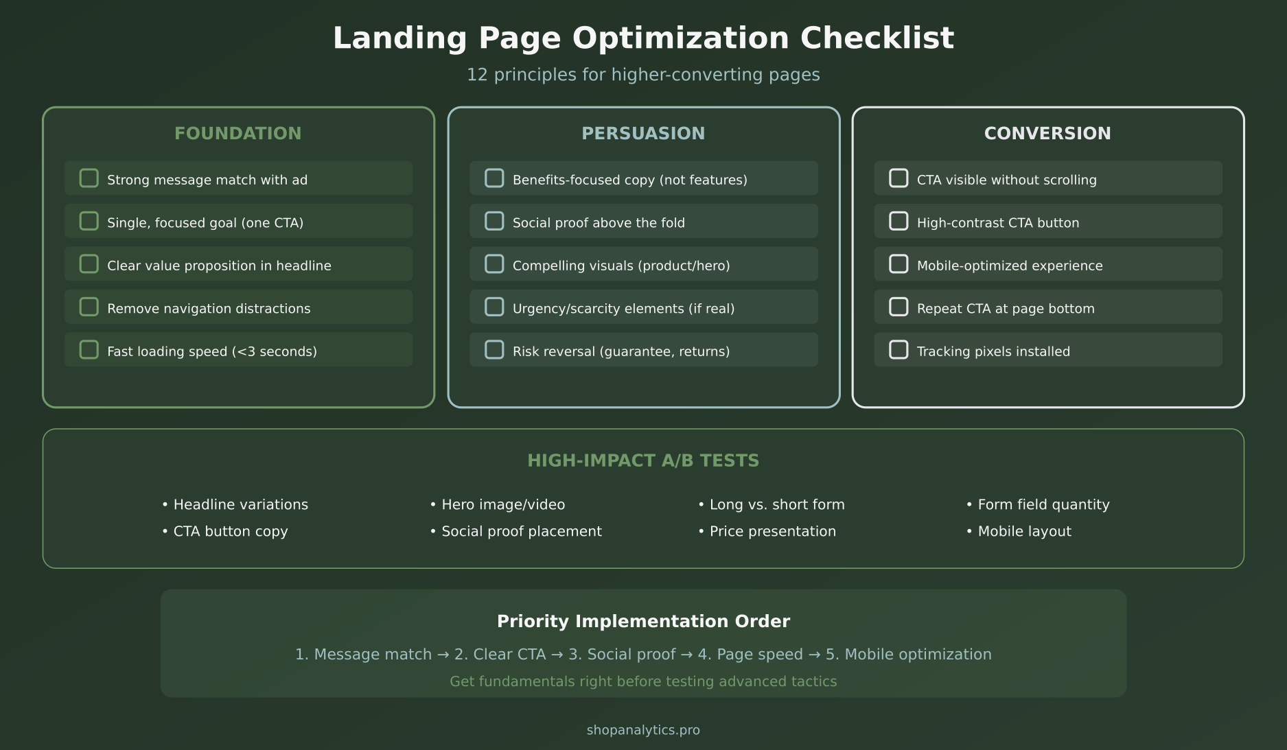
Priority Implementation Order
If you’re starting from scratch or overhauling existing landing pages, here’s the order that delivers the fastest ROI:
- Message match — align your ad copy with your landing page headline
- Clear CTA — one prominent, high-contrast button above the fold
- Social proof — add reviews, ratings, or trust badges
- Page speed — compress images and minimize scripts
- Mobile optimization — responsive layout with thumb-friendly buttons
Get these five fundamentals right before testing advanced tactics like urgency timers, exit-intent popups, or video backgrounds. The basics account for 80% of your results.
Frequently Asked Questions
How many landing pages should I have?
At minimum, one per major campaign or promotion. Companies with 30+ landing pages generate 7x more leads than those with fewer than 10. More pages means more targeted messaging, which means better conversion rates. That said, start with your highest-spend campaigns and expand from there.
Should I use a landing page builder or custom code?
For most e-commerce stores, a landing page builder like Shogun, GemPages, or PageFly (Shopify) or Elementor (WooCommerce) is the fastest path. They offer e-commerce-specific templates and integrations. Custom code gives more control but requires development resources. Start with a builder and graduate to custom when you’ve validated your approach.
How long should my landing page be?
It depends on your product’s complexity and price point. For impulse purchases under $50, keep it short — hero, social proof, CTA. For considered purchases over $100, longer pages with detailed benefits, comparisons, and FAQ sections outperform short ones. Test both formats with your specific audience to find the sweet spot.
Key Takeaways
Landing page optimization isn’t rocket science, but it does require discipline and attention to detail. Here’s what matters most:
- Message match is everything — align your ad promise with your page delivery
- One page, one goal — remove distractions and focus on a single CTA
- Choose the right page type — product, collection, or lead capture based on campaign goal
- Mobile first — 70%+ of your ad traffic is on phones
- Test systematically — one element at a time with proper statistical methods
- Track everything — set up event tracking before launching campaigns
The bottom line? Every dollar you spend on landing page optimization pays for itself many times over. Start with message match and a clear CTA. Then build from there. Your paid traffic deserves better than a generic homepage — give it a landing page that actually converts.
Sophie Andersson
Technical marketer with 7+ years in e-commerce growth teams. Started as a developer, moved into marketing, and now lives at the intersection of both worlds. Believes that good analytics shouldn't require a PhD to understand.
More about me →